ILC Diliman
ILC’s Top 3 New Features for Iskomunindad
- March 1, 2019
“Iskwiki is GONE?” I asked John Mark Roco, our Emergency Web Service Developer. “Hindi po, Sir. In-update lang natin,” he replied. I sighed with relief. Iskwiki has been a University treasure of sorts, helping freshies know more about the college. Being an alumnus of UP Manila myself, I felt like a freshie before I took my MA here. I remember how it led me to the updated contact number of our college, and even the steps for application.
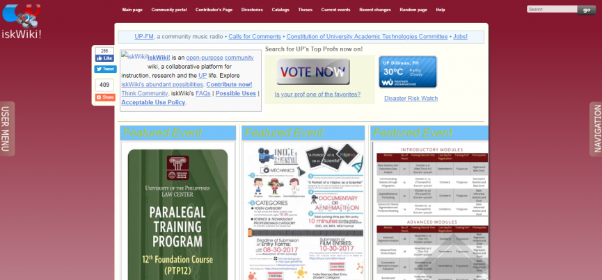
The Classics: The old iskwiki page
I heard the news that the old iskwiki was lacking in updates and new tech. I’m sure you’ve seen Wikia, the fan-powered wikipedia page handled by netizens when (re)searching for your favorite anime or video game. It looked primitive a few years ago. It had sad mobile responsiveness which was bad, considering 52% of websites are accessed via mobile devices. Menus and content littered the page. It was like a gradescholler’s MySpace page in 2000s. Now, it’s an updated, highly-customizable haven for fans and fans-to-be of genres.
This royal treatment of Wikia mirrors the makeover that Iskwiki will have. Under the banner of Iskomunidad, it promises new features, improved attributes, and an overall fresh brand for timeless content.
This brings us to our first favorite feature: The Interface!
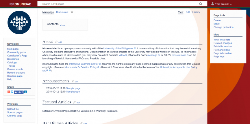
A Timely, Timeless Update: Iskomunidad’s New Face
It’s like seeing your old house bathed in new paint, minus the smell. Comparing the old and new interfaces, one can already see the cleaner and more organized layout. All navigational buttons are on the left, reminiscent of Wikipedia’s UX. The minute speck that is the search bar was in the upper-right of the old page, and is now proudly sitting on top of the page. It even boasts the current number of pages we’re ready to offer to users: 3,700++ old and new content. Don’t get me started on the new background design, too.
This brings us to feature number two: Easier Creation Tools
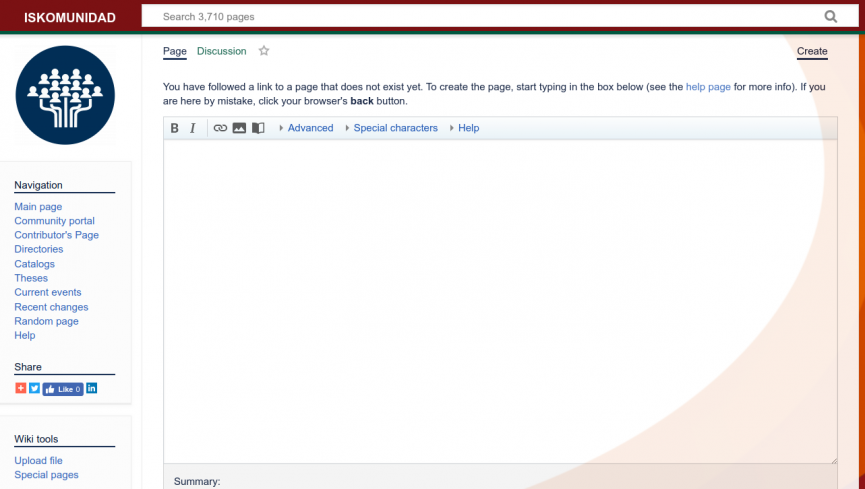
Ever wonder why the Download pages of websites have less buttons on it? Because it tries to guide you to a specific action. Before, if you were an honest-to-goodness UP student who wished to create new pages for your college or your organization for iskwiki, you were probably a bit lost. The old interface had no quick buttons for content-makers. It’s a turnoff as far as User Interface is concerned. Now, there are two quick ways to make new pages:
- Clicking on the “Create your First Iskwiki Page/Article”
- Simply scroll down when you first open the webpage and voila! You can name your page and start editing:

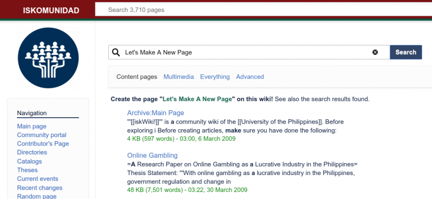
Step Two: Search and Create
Using the nifty search bar above, simply search for a page. If it’s non-existent, it will prompt you to create a new page:
P.S.: You have to be logged in using your official UP LDAP Credentials (this the account you use for CRS).
See, now we are no longer lost in the pages. Speaking of being lost, we have another feature so we can be found: Google Maps Embedding.
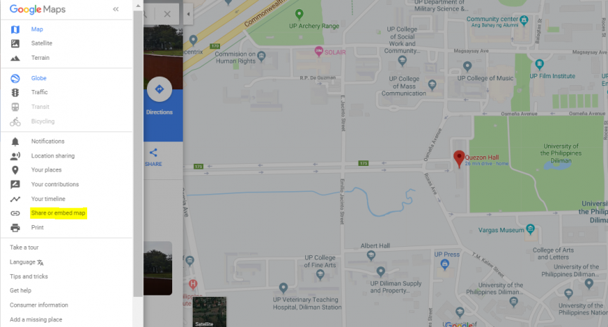
If your org has a tambayan or your department has relocated, guide others to it using Google Maps. Simply search for the location you wish to embed in Google Maps, then click the option button (☰):
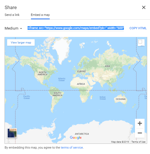
Click Share or Embed Map:
Then copy the link as seen above. Your iskomunidad page can now feature this location!
In summary:
The new adjustments made has turned iskwiki to iskomunindad; a more feature- inclusive and user-friendly portal to share information with our collegues and peers. This will be available on March, so make sure to visit our social media page (https://www.facebook.com/ilcdiliman/) when we upload the link!


